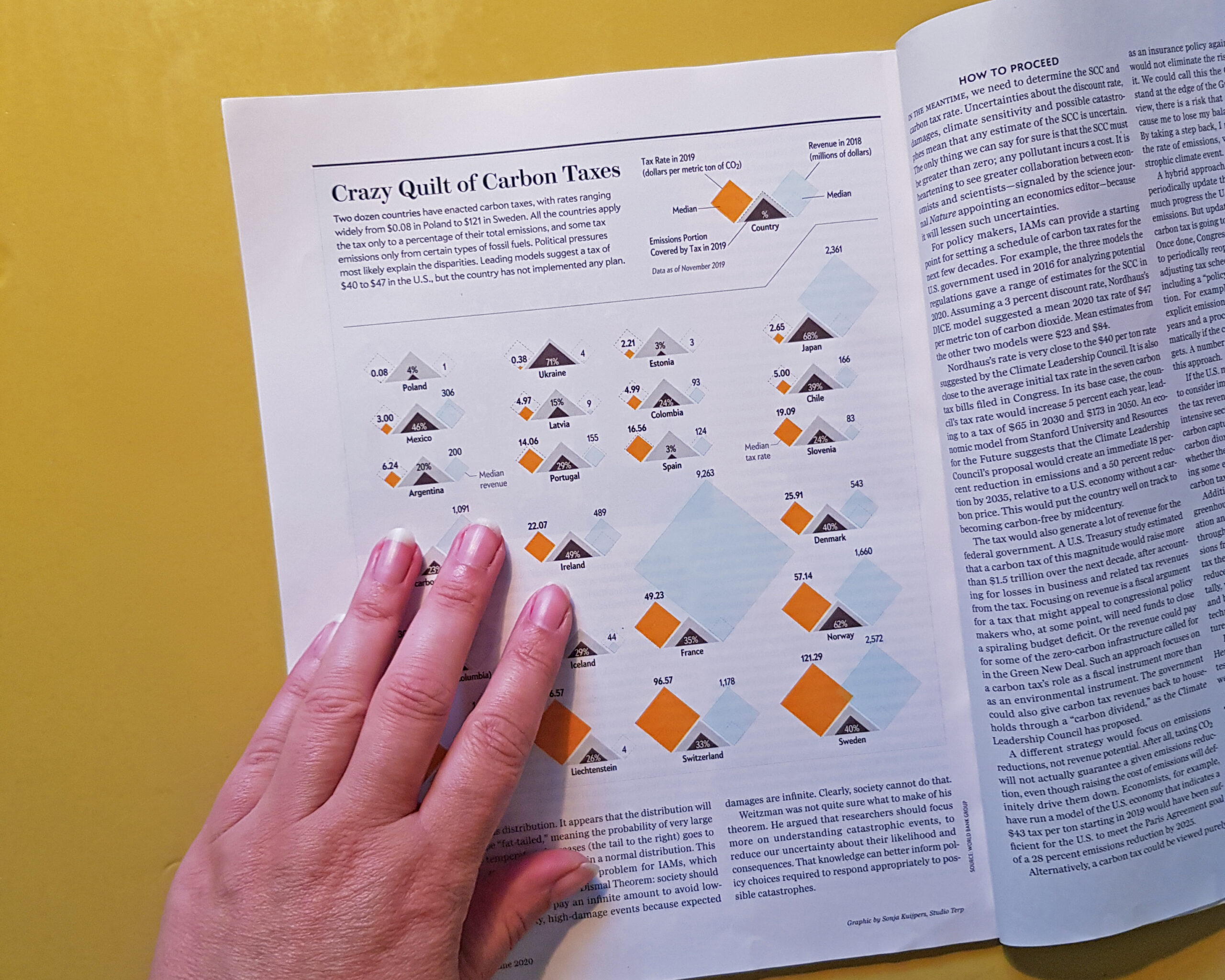
Carbon Tax, a datavisualization for Scientific American
I got the request by Scientific American to create a medium sized datavisualization on the Carbon Tax data of various countries. There were a few categories that needed to be visualized in a way that one could compare the countries. Therefor I decided to create small multiples. As France was an outlier, I had to rearrange the adjacent countries, to fit all in a grid.


